The trap of node size
How is the node size calculated exactly?
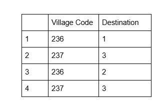
The first thing to notice here on this graph is the nodes’ size. Vancouver and Victoria loom to be the most prominent destinations. Hmm.. let’s pause for a second here, do you think that’s because Vancouver and Victoria are connected to the largest number of villages, as the graph seemingly suggests? In other words, do you think the node size corresponds only to how many lines it connects to? To find the answer, let’s see how we can simplify our data. So below is an extremely simplified spreadsheet with only 4 rows of hypothetical records. Note that each row represents an immigrant. In the original dataset, there are many other variables about the immigrants’ demographic information such as age, arrival year, and height, but for the sake of clarify only the two variables-the origin (village code) and destination are retained.
After feeding it to Palladio (put village code as Source, and destination as Target), here is the visualization Palladio spit out:
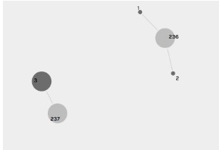
Now let’s put a spotlight on Destination 3: it is only connected to one village (237), then how come its size is larger than that of Destination 1 and 2? Well, it turns out, a node size is related to how many lines it connects to, but this is not the whole picture. In fact, a node size is also tied to another factor: how many immigrants a village sent. We can write an equation like this:

Let’s first take a destination node as an example to see how we can apply the equation: n= how many villages the destination is connected to (how many lines a destination is connected to) Ai= the number of immigrants each village sent So what this equation computes is the sum of the immigrants that each village sent which is connected to this destination. Now it’s clear that a node size equals the total number of immigrants that the corresponding destination received, or if we speak in the statistical language, the node size corresponds to the frequency of this destination! I find it fascinating to build a mental linkage between the network visualization and the statistics based off on the same data.
Node degree and weighted degree
Now let’s link what we’ve learnt so far with network theories. Degree is an important concept in network theories- node degree is simply how many edges it’s connected to. With Palladio or Gephi (a popular network analysis tool), you can choose to size your nodes by degree or another numeric attribute (in Palladio, it’s not called degree, but just number of …). It is important, however, to understand that node size , in my case, is not calculated based on node degree, but rather, weighted degree, since the graph I created is a weighted graph- meaning each village often sends more than one immigrant.
Compare sizing geographic points with sizing nodes
I’m alway fascinated with connecting concepts from different domains. And as a result of this habit, I was wondering about what exactly sizing a point on a map apart from a sizing node in a network (why, they all just appear to be dots!). Here’s the conclustion I came to:
Either a point on a map or a node on a network can be sized by a numeric attribute. It’s more common, however, to size a node by degree (or in my case, weighted degree) than by an attribute.
To illustrate these points, let’s look at these two graphs below.
This is a street tree map for a few blocks in Vancouver, on which each dot is a tree (aligning with the individual rows/records in the raw data), with the color shade responding to the tree’s height and the size to diameter.

By comparison, for the graph spit out by Palladio, each node is a village or a destination, the node size meaning weighted degree.
