The visualization produced by Palladio
The normalization of village names opens up the opportunity to explore the migration patterns of the early Chinese immigrants at much greater granularity. I was interested to get down to village, which I believe could serve as a closely-knit clan or social unit, and examine migration patterns.
To that end, I followed a few steps to produce a networkshop visualization using Palladio:
1.Filter the original data to one county ( I used Zhongshan as an example)
2.Go to Palladio, click on Start, and then “Create a new project” from the left
3.Drag and drop the csv file to the middle box, and click on upload
4.Check if the types of the variables have been recognized correctly
5.Click on the tab “Graph”
6.Choose the variable “MatchCH_ID” (which is the normalized villages of the immigrants’ origin) as “Source”, and “New_Dest” (which is the immigrants’ destinations in Canada) as “Target”
7.Check the box “Highlight” so that source and target nodes will be differentiated by two different shades
8.Check the box “Size nodes”
And boom! We’ve got the visualization: 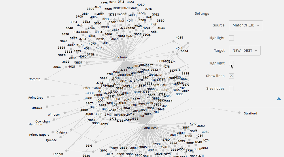
An initial interpretation of the graph:
Each number represents an origin village in China where immigrants were from, while the immigrants’ destinations are spelled (with darker shade). Wherever a village node is connected to a destination node (speaking of network jargon, this is an “edge”), it means there were immigrants originating from the village in China who chose that destination in Canada. If you feel confused over these jargons, such as node and edge, you may take a quick look at this guide for the basic concepts of network analysis.
Now here comes the more interesting part- let’s try to dig deeper into the graph.